A working guide to the identity, language, and components behind gtabiri.com. See how the same decisions carry from a web page to paper, fabric, and a vehicle.
Use Identity and color for the artwork, Digital foundations for working examples, and Production for print and physical applications. The master SVG is the source for the logo. Application mockups illustrate intent, and proofing notes identify what still needs verification.
02.01 / The mark
The Gyata Tabiri Mark
A name made visible through geometry.
Gyata means lion in Akan. The frontal gaze expresses composure and courage, while the surrounding shapes reveal the face through negative space.
A face drawn in negative space
The Bloodwood forms around the face do part of the drawing by leaving room for the background to show through. That makes the surface behind the mark part of its legibility.
Order with a little movement
The circle sits deliberately off center. The eye can find the lion immediately, then follow the slight shift outward into the radial field. The geometry establishes order while the displacement gives the mark movement.
Three readings of sixteen
Four squared. The corners of a square, the seasons, and the cardinal directions suggest a foundation. Four times four carries that order into the radial field.
Sixteen directions. A sixteen-point compass offers finer bearings between its main directions. The points reach outward while the lion holds the center.
Base sixteen. Hexadecimal uses sixteen digits, from 0 through 9 and A through F. In web design those digits express colors such as Bloodwood #951716. The number connects the visual work of choosing a color with the technical work of specifying it.
Two circles preserve a moment
The two detached circles encode August 12. April starts the mark’s Aries-based sequence at one, which places August at five. Mapping the twelfth day of a 31-day month onto an hour gives roughly 23 minutes.
August → 5(12 ÷ 31) × 60 ≈ 235:23
The larger circle sits nearer the center, like the shorter hour hand. The smaller circle sits farther out, like the longer minute hand. The implied clock gives the two shapes meaning while leaving them free to read as part of the composition.
From a distance, the mark reads as a lion. Up close, its geometry connects a name, a way of working, and a personal date.
Placing the Bloodwood mark
Preserve the original proportions and leave clear space around the outer points and both circles. Choose a quiet background, then check that the face and the two circles still read at the intended size.
02.02 / Logo artwork and misuse
The full signature and the standalone mark
The full Bloodwood signature includes the lion, name, and tagline.The standalone lion for compact placements.
Use the full Bloodwood SVG when there is room for the name and tagline to read clearly. Use the standalone lion artwork when space is limited. Check that the entire tagline can be read comfortably at the intended viewing distance, and that the face and both detached circles stay distinct. Enlarge the signature if the tagline is difficult to read. Verify small print placements with an actual-size proof.
One-color black. Use this version for receipts and other black-only output when the tagline remains legible. For narrow receipt printers, test at actual size and use the standalone mark if the lettering breaks up. Download the black SVG.
Typography and color in the master
The Gyata Tabiri wordmark uses Trajan Pro. The tagline, “Inspired. Precise. Purposeful.”, uses Source Sans 3 Regular. Both are outlined in the master SVG, so displaying the logo requires no font installation. The website uses Source Serif 4 for headings and Source Sans 3 for body copy.
Bloodwood is #951716 in the full signature and the interface palette. Use the master SVG for screen artwork. See Print color and proofing for the Pantone Matching System (PMS) candidate and CMYK workflow.
What not to do
Do not retype the name or tagline. Use the complete signature artwork to preserve their relationship.
Do not stretch the artwork, crop the outer shapes, or remove either circle. Give the entire silhouette room to breathe.
Do not add the retired Golden Saffron cross or recolor the lion to match an application. Use a quiet surface that gives Bloodwood enough contrast.
Do not trace the mark from a mockup. Start from the master and inspect a proof at the intended size.
02.03 / Mark at small sizes
How small can the lion go?
A mark that reads clearly on a letterhead may lose detail in a browser tab or on a woven label. Compare the examples at their displayed sizes and look for the face, the gaps around the outer shapes, and both detached circles.
16 px
24 px
32 px
48 px
64 px
96 px
Check the lion in three places
Face. Can you recognize the lion without zooming in? Watch the narrow openings around the eyes and muzzle.
Outer shapes. Can you still see the gaps between the outer shapes and the center? Check the mark against the background it will sit on.
Two circles. Can you see both circles separately and tell which is larger?
Check the full signature separately
Compare the three widths below at normal browser zoom. Each label measures the SVG frame, including its clear space. Read the entire tagline at the distance someone would normally view the piece. If the available space makes it hard to read, use the standalone lion or give the signature more room.
120 px frame width
180 px frame width
240 px frame width
Record what passes
On screen, test the actual placement, including the background and the smallest supported viewport. For print, set the artwork width in millimeters and print at 100%. For a receipt, use the intended printer and paper. For embroidery or weaving, ask for a sample made with the actual thread and fabric.
Record the artwork version, width, medium, background, viewing distance, and first detail that failed. The smallest size that passes all the checks can become the minimum for that application. The examples above are starting points for comparison. Production minimums are still open.
Lead paragraph: an introduction should give someone a reason to continue.
Body paragraph: Source Sans 3 carries the explanation. Judge the line length, contrast, spacing, and reading rhythm together.
Strong emphasis gives an important phrase weight. Italic emphasis changes the stress. A text link points to a destination.
Small supporting text: useful for dates, captions, and metadata.
A normal list item.
A longer item that wraps so you can judge the spacing between lines.
Understand the purpose.
Make a considered decision.
Check the result.
Inline code: aria-expanded="true".
02.04A / Usage & implementation
From specimen to implementation
PurposeChoose the pattern for the reader’s task.
StructureKeep semantic HTML and accessible labels.
PresentationLoad the shared fonts and component classes.
VerificationCheck keyboard use, small screens, and print.
When to use it
Keep one clear page title. Choose heading levels by content relationship; adjust appearance with a class rather than changing the document hierarchy.
Required pieces
On the web, load Source Serif 4 and Source Sans 3 once with the shared stylesheet. Body text starts at 1.05rem with 1.65 line height. Heading sizes follow the shared H1–H6 scale. See the reference below for email, slides, and paper.
View HTML recipe </>
Adapt the text and destinations. Keep IDs unique.
<h1>The page title</h1>
<p class="lead">A short introduction to the page.</p>
<h2>A meaningful section heading</h2>
<p>Body copy explaining the subject.</p>
<h3>A supporting idea</h3>
<p class="small">A caption or supporting note.</p>
In context / Typography across media
One message, four ways to read it
Imagine sending a project update titled “The first outline is ready.” On the website, a short introduction gives the decision some context. In email, lead with the action: “Review the outline and tell me what’s missing.” On a projector, keep the title and that action visible from the back of the room. On paper, include the date and the next review step so the handout still makes sense after the meeting.
GTABIRI typography by medium. Email, projection, and paper sizes are starting points to test.
Medium
Size and spacing
What to check
Web · phone and desktop
H1 2.25–3rem, H2 1.75–2.25rem, H3 1.5–1.75rem. H4 1.25rem, H5 1.1rem, H6 1rem. Body 1.05rem with 1.65 line height.
The first three headings scale with the viewport. Keep body type readable on a phone, and limit line length as the page gets wider. Check at browser zoom and with longer headings.
HTML email
Start with a 28–32px title and 17px body with 26–28px line height. This is close to the website’s 1.05rem body at a 16px root.
Keep the serif heading and sans-serif body relationship. Use Georgia and Arial as fallbacks, with inline type styles. Send a real test to the email clients the audience uses and inspect it on a phone.
Projected slide
Start with a 36–44pt title and 24–28pt body. Use a strong contrast pair and leave space around the text.
Read the slide from the farthest seat. Cut the wording or split the slide if the text needs to get smaller. Put supporting details in the handout.
Letter or A4 handout
Start with an 11pt body on 15pt leading, a 20–24pt title, and 9–10pt captions.
Read an actual-size proof. Check margins, line lengths, and whether headings and captions stay with the material they describe on both paper sizes.
Carry the same hierarchy, wording, and color roles from one medium to the next. Match the reading experience by adjusting size, line length, and spacing for the viewing distance and available space.
The palette began with colors associated with Kutztown University and developed into a personal identity. Bloodwood is primary, Golden Saffron is secondary, and the remaining colors are tertiary. The tertiary colors include both reading surfaces and supporting accents. Bloodwood carries the mark and expresses courage and resolve. Golden Saffron serves as a website accent and recalls illumination and achievement. Cloud Veil provides a quiet neutral for cards and borders, Sandstone Mist brings warmth, and Rich Black gives text and navigation depth. Lagoon Blue suggests clarity, Verdant Jade signals growth, and Midnight Indigo adds a quieter accent.
Print values are CMYK percentages in C, M, Y, K order. Reference conversions are pending physical proof.
Bloodwood
Primary · Mark and actions
HEX
#951716
RGB · sRGB
149, 23, 22
CSS variable
--bloodwood
CMYK · Uncoated
6, 100, 81, 30
CMYK · Coated
10, 95, 84, 39
Pantone Coated · Spot ink
7627 C
Pantone Uncoated · Spot ink
1797 U
Golden Saffron
Secondary · Interface accent
HEX
#D5AF37
RGB · sRGB
213, 175, 55
CSS variable
--golden-saffron
CMYK · Uncoated
5, 18, 84, 10
CMYK · Coated
8, 23, 81, 12
Pantone Coated · Spot ink
7753 C
Pantone Uncoated · Spot ink
110 U
Rich Black
Navigation / footer
HEX
#010B13
RGB · sRGB
1, 11, 19
CSS variable
--rich-black
CMYK · Uncoated
96, 61, 35, 87
CMYK · Coated
89, 63, 43, 90
Pantone Coated · Spot ink
Black 6 C
Pantone Uncoated · Spot ink
Neutral Black U
Slate Shadow
Body text
HEX
#4A4A4A
RGB · sRGB
74, 74, 74
CSS variable
--slate-shadow
CMYK · Uncoated
61, 50, 37, 49
CMYK · Coated
57, 48, 42, 54
Pantone Coated · Spot ink
446 C
Pantone Uncoated · Spot ink
446 U
Peach Linen
Approved · Field and warm surface
HEX
#F4E0C5
RGB · sRGB
244, 224, 197
CSS variable
--peach-linen
CMYK · Uncoated
3, 10, 18, 0
CMYK · Coated
4, 12, 23, 0
Pantone Coated · Spot ink
7506 C
Pantone Uncoated · Spot ink
7506 U
Sandstone Mist
Panels / topic groups
HEX
#F1E6D0
RGB · sRGB
241, 230, 208
CSS variable
--sandstone-mist
CMYK · Uncoated
5, 7, 15, 0
CMYK · Coated
6, 9, 19, 0
Pantone Coated · Spot ink
7527 C
Pantone Uncoated · Spot ink
Warm Gray 1 U
Ivory Dust
Light content surfaces
HEX
#F5F5F5
RGB · sRGB
245, 245, 245
CSS variable
--ivory-dust
CMYK · Uncoated
3, 2, 2, 0
CMYK · Coated
4, 3, 3, 0
Pantone Coated · Spot ink
Paper white (no spot ink)
Pantone Uncoated · Spot ink
656 U
Pantone · Textile
11-4001 TCX · Brilliant White
Cloud Veil
Cards / borders
HEX
#E5E5E5
RGB · sRGB
229, 229, 229
CSS variable
--cloud-veil
CMYK · Uncoated
9, 6, 6, 0
CMYK · Coated
11, 8, 8, 0
Pantone Coated · Spot ink
663 C
Pantone Uncoated · Spot ink
7541 U
Verdant Jade
Supporting accent
HEX
#27A74A
RGB · sRGB
39, 167, 74
CSS variable
--verdant-jade
CMYK · Uncoated
73, 0, 94, 0
CMYK · Coated
74, 1, 86, 0
Pantone Coated · Spot ink
347 C
Pantone Uncoated · Spot ink
361 U
Lagoon Blue
Supporting accent
HEX
#15A2B9
RGB · sRGB
21, 162, 185
CSS variable
--lagoon-blue
CMYK · Uncoated
75, 5, 17, 3
CMYK · Coated
72, 8, 19, 7
Pantone Coated · Spot ink
3125 C
Pantone Uncoated · Spot ink
3125 U
Clay Rose
Page background
HEX
#DEBEB1
RGB · sRGB
222, 190, 177
CSS variable
--clay-rose
CMYK · Uncoated
10, 22, 21, 1
CMYK · Coated
11, 26, 25, 2
Pantone Coated · Spot ink
7611 C
Pantone Uncoated · Spot ink
7590 U
Midnight Indigo
Supporting accent
HEX
#2A317D
RGB · sRGB
42, 49, 125
CSS variable
--midnight-indigo
CMYK · Uncoated
100, 99, 0, 2
CMYK · Coated
95, 86, 4, 13
Pantone Coated · Spot ink
288 C
Pantone Uncoated · Spot ink
Dark Blue U
How to read the palette
For a website: use the hex value, including the #. In this site’s CSS, use the named variable to keep colors consistent across pages.
For a print shop: the four numbers are percentages in Cyan, Magenta, Yellow, Black order. Uncoated uses PSO Uncoated v3 (FOGRA52) as a reference for plain stock. Coated uses PSO Coated v3 (FOGRA51) as a reference for coated stock, including matte and gloss. These are rounded conversions from sRGB using relative colorimetric rendering with black-point compensation. They are starting values for those press conditions. Confirm the printer’s profile and approve a proof on the chosen paper.
For a home or office printer: start with the sRGB artwork and select the paper you actually loaded in the printer settings. Plain Paper and Photo Paper are media settings. Standard and Photo can also be quality settings, depending on the printer. Follow the printer’s paper and color instructions.
Bloodwood’s HEX and RGB values describe the same screen color. Its two CMYK recipes use different ink amounts because the press and paper affect the result. Each recipe aims for a recognizable Bloodwood in its intended medium. The swatch shows the screen color, and a physical proof shows what to expect on the chosen paper. A Pantone spot ink is printed as a separate premixed ink. The references on the cards are estimates from a digital swatch comparison for coated and uncoated stock. Slate Shadow uses 446 U to keep its charcoal appearance distinct from Rich Black’s Neutral Black U. On white coated stock, Ivory Dust can use the paper itself when it serves as the lightest background. Use its coated CMYK tint when the design needs a visible distinction from the paper. Cloud Veil uses 663 C as its coated spot reference. Ivory Dust’s Brilliant White TCX reference applies to textiles. A physical proof is a sample made on the intended paper so you can judge the actual ink before approving the run. For spot ink and physical approval, see Print color and proofing.
02.05A / Usage & implementation
From specimen to implementation
PurposeChoose the pattern for the reader’s task.
StructureKeep semantic HTML and accessible labels.
PresentationLoad the shared fonts and component classes.
VerificationCheck keyboard use, small screens, and print.
When to use it
Use Bloodwood for identity and actions, neutrals for reading surfaces, and Golden Saffron as an accent. Color alone should not carry meaning.
Required pieces
Variables come from core/css/style.css. Peach Linen (#F4E0C5) is the approved warm surface and field token.
View HTML recipe </>
Adapt the text and destinations. Keep IDs unique.
<!-- Existing token names used in a component stylesheet -->
<style>
  .example-panel {
    background: var(--sandstone-mist);
    color: var(--slate-shadow);
    border-left: 4px solid var(--bloodwood);
  }
</style>
<div class="example-panel">A readable supporting panel.</div>
03.01 / Voice and writing guidance
Write so someone can act on it
GTABIRI sounds like a designer who can sit down with a team, ask a useful question, and explain what happens next. Name the work in plain language. Show the reasoning where it helps the reader decide. Make promises specific enough to keep.
Homepage · Help someone see the fit
“You may have a design ready to build, a message that needs clarity, or several pieces that need to work together. I can take responsibility for the part your team needs, with the wider project in mind.”
Name a situation a recruiter or business owner recognizes, then explain where you can help.
Form error · Give a way forward
“Enter an email address in this format: name@example.com.”
Put the message beside the field. Give one concrete fix and keep the person’s other answers available.
Case study · Describe your contribution
“At Edgewood Properties, I worked on websites and email for the property portfolio. The dated email samples show how the work changed from one property or event to another.”
Name your role and point to the evidence. Include a result only when you can explain how it was measured or who reported it.
Follow-up · Make one promise
“Thanks for making time today. I’ll send the first outline on Friday so you can tell me whether it reflects what we discussed.”
Use the next step you actually agreed on. A specific handoff gives the recipient a reason to keep the note.
04.01 / Layout and images
Space, proportion, and responsive behavior.
The grid is existing Bootstrap behavior. Use the spacing scale below for new additions; existing styles may use literal values.
4px / .25rem
8px / .5rem
12px / .75rem
16px / 1rem
24px / 1.5rem
32px / 2rem
48px / 3rem
Existing container and breakpoint reference
Viewport
Container maximum
Typical use here
Below 576px
Full width with gutters
Stacked components
576px+
540px
Small-screen container
768px+
720px
Insights sidebar and medium columns
992px+
960px
Expanded main navigation
1200px+
1140px
Wide content container
The catalogue uses its own wider workspace. Production content containers are not changed.
Images that introduce
Use a consistent thumbnail ratio for a row of project cards. Crop deliberately with object-fit: cover; review the subject at narrow widths. Set image dimensions to reserve space.
Images that prove
Preserve complete logos, artwork, and screenshots when their detail is the evidence. Use proportional height or a contained frame. Keep a full-size destination available when needed.
Reading widths
Prefer a comfortable reading column over stretching paragraphs across a wide screen. This catalogue limits article specimens to a readable measure while allowing tables and state boards to use more space.
Fixed navigation
Reserve space for the header and any mobile toolbar once in the layout. The Insights template has a shared offset; do not compensate by adding unrelated margins to individual headings.
04.01A / Usage & implementation
From specimen to implementation
PurposeChoose the pattern for the reader’s task.
StructureKeep semantic HTML and accessible labels.
PresentationLoad the shared fonts and component classes.
VerificationCheck keyboard use, small screens, and print.
When to use it
Start with the existing Bootstrap container and grid. Use the spacing scale as a proposed reference, not a claim that all older spacing is already standardized.
Required pieces
Bootstrap 4.4.1 containers and responsive columns. The layout below uses existing breakpoint behavior; the visual spacing bars belong only to this catalogue.
C shows the full article. A adds optional detail. B holds an alternate version. Reading time uses 220 words per minute.
A · Optional detail Summary, highlights, then a reveal button
Consistency should leave room for the message.
Gyata Tabiri·Estimated reading time
A shared identity should make the next piece easier to create, while leaving room for its particular audience and purpose.
If you only have a minute
The questionWhat should stay recognizable?
The decisionKeep the identity; adapt the hierarchy.
The checkTry a different message and copy length.
The handoffLeave usable assets and clear guidance.
A clear visual identity gives people a useful starting point, but the next piece still needs its own decisions. A short announcement, a detailed invitation, and a campaign email do not ask the reader to do exactly the same thing. The hierarchy should reflect that difference.
The message sets the emphasis
A clear visual identity gives people a useful starting point, but the next piece still needs its own decisions. A short announcement, a detailed invitation, and a campaign email do not ask the reader to do exactly the same thing. The hierarchy should reflect that difference.
Consider an event invitation. The date, location, and next action need to be easy to find. If the artwork is recognizable but those details are buried, consistency has not done enough of the work. A shared identity should help organize the message rather than compete with it.
The design review can begin with the question the reader needs answered first. That gives typography, imagery, and spacing a purpose. It also gives feedback something more specific to discuss than whether the piece feels exciting enough. Two different layouts can express the same identity while supporting different priorities.
Leave room for the next piece
A useful template leaves room for those differences. It establishes the decisions that should stay consistent, then makes ordinary changes understandable. Longer names, a second date, or an unexpected amount of copy should not require rebuilding the whole composition. Those are useful cases to try while the template is still being developed.
The same care applies to the handoff. The next person needs the current assets, an editable file, and a short explanation of anything that is easy to change incorrectly. A reference only helps if people can find it and connect its guidance with the material in front of them.
This text is a specimen for comparing reading layouts. It is not a project account or a testimonial. The purpose of the preview is to see how a title, estimated reading time, summary, highlights, and full text work together before choosing a presentation for the real articles.
Current styles: .read-more-btn, .case-highlights-card, .highlight-grid.
B · Alternate version A compact, expandable article
Consistency should leave room for the message.Estimated reading timeA recognizable identity does not require every message to use an identical layout.A clear visual identity gives people a useful starting point, but the next piece still needs its own decisions. A short announcement, a detailed invitation, and a campaign email do not ask the reader to do exactly the same thing. The hierarchy should reflect that difference.Read the full articleClose the full article
A clear visual identity gives people a useful starting point, but the next piece still needs its own decisions. A short announcement, a detailed invitation, and a campaign email do not ask the reader to do exactly the same thing. The hierarchy should reflect that difference.
Consider an event invitation. The date, location, and next action need to be easy to find. If the artwork is recognizable but those details are buried, consistency has not done enough of the work. A shared identity should help organize the message rather than compete with it.
The design review can begin with the question the reader needs answered first. That gives typography, imagery, and spacing a purpose. It also gives feedback something more specific to discuss than whether the piece feels exciting enough. Two different layouts can express the same identity while supporting different priorities.
A useful template leaves room for those differences. It establishes the decisions that should stay consistent, then makes ordinary changes understandable. Longer names, a second date, or an unexpected amount of copy should not require rebuilding the whole composition. Those are useful cases to try while the template is still being developed.
The same care applies to the handoff. The next person needs the current assets, an editable file, and a short explanation of anything that is easy to change incorrectly. A reference only helps if people can find it and connect its guidance with the material in front of them.
This text is a specimen for comparing reading layouts. It is not a project account or a testimonial. The purpose of the preview is to see how a title, estimated reading time, summary, highlights, and full text work together before choosing a presentation for the real articles.
Use B for an alternate version within a section, such as a technical explanation. The whole summary opens it with a mouse or keyboard.
The reader sees the complete piece immediately. No reveal step is required.
A clear visual identity gives people a useful starting point, but the next piece still needs its own decisions. A short announcement, a detailed invitation, and a campaign email do not ask the reader to do exactly the same thing. The hierarchy should reflect that difference.
Consider an event invitation. The date, location, and next action need to be easy to find. If the artwork is recognizable but those details are buried, consistency has not done enough of the work. A shared identity should help organize the message rather than compete with it.
The design review can begin with the question the reader needs answered first. That gives typography, imagery, and spacing a purpose. It also gives feedback something more specific to discuss than whether the piece feels exciting enough. Two different layouts can express the same identity while supporting different priorities.
A useful template leaves room for those differences. It establishes the decisions that should stay consistent, then makes ordinary changes understandable. Longer names, a second date, or an unexpected amount of copy should not require rebuilding the whole composition. Those are useful cases to try while the template is still being developed.
The same care applies to the handoff. The next person needs the current assets, an editable file, and a short explanation of anything that is easy to change incorrectly. A reference only helps if people can find it and connect its guidance with the material in front of them.
This text is a specimen for comparing reading layouts. It is not a project account or a testimonial. The purpose of the preview is to see how a title, estimated reading time, summary, highlights, and full text work together before choosing a presentation for the real articles.
Use this pattern when readers should see the complete article without opening a disclosure.
04.02A / Usage & implementation
From specimen to implementation
PurposeChoose the pattern for the reader’s task.
StructureKeep semantic HTML and accessible labels.
PresentationLoad the shared fonts and component classes.
VerificationCheck keyboard use, small screens, and print.
When to use it
Choose the full article for short pieces. Use a reveal when the summary genuinely helps someone choose whether to continue.
Required pieces
C is the default full article. A adds optional detail below a complete summary. B offers an alternate version within a section, such as a technical explanation. A uses a reveal controller; B uses native details.
View HTML recipe </>
Adapt the text and destinations. Keep IDs unique.
<article class="section insight" id="full-article">
  <div class="container">
    <h1>Article title</h1>
    <p class="small">By Gyata Tabiri<span data-read-time></span></p>
    <p class="lead">A specific summary of the question the article explores.</p>
    <div data-article-copy>
      <h2>The first decision</h2>
      <p>The complete article begins here.</p>
    </div>
  </div>
</article>
<script>
  const article = document.getElementById('full-article');
  const text = article.querySelector('[data-article-copy]').textContent.trim();
  const words = text.split(/\s+/).filter(Boolean).length;
  const minutes = Math.max(1, Math.ceil(words / 220));
  article.querySelector('[data-read-time]').textContent = ' · About ' + minutes + ' min read';
</script>
Additional experimental recipes below. The reveal recipe includes its controller and a calculated reading estimate. The native disclosure includes scoped CSS. Load the site fonts and stylesheet first; use unique IDs when repeating a recipe.
Summary + reveal button </>
Working comparison recipe; review before applying site-wide.
<article class="section insight" id="reading-example">
  <div class="container">
    <h1>The question behind the work</h1>
    <p class="small">By Gyata Tabiri · <span id="reading-estimate">Reading time</span></p>
    <p class="lead">A concise summary that helps someone decide whether to continue.</p>
    <div class="case-highlights">
      <h2 class="h5 highlight-title">If you only have a minute</h2>
      <p>The central decision, explained in one or two sentences.</p>
    </div>
    <button class="read-more-btn" id="reading-toggle" type="button"
            aria-expanded="true" aria-controls="reading-full" hidden>Continue reading</button>
    <div id="reading-full">
      <h2>The first decision</h2>
      <p>Replace this paragraph with the complete article.</p>
    </div>
  </div>
</article>
<script>
(function () {
  const article = document.getElementById('reading-example');
  const button = document.getElementById('reading-toggle');
  const full = document.getElementById('reading-full');
  const estimate = document.getElementById('reading-estimate');
  if (!article || !button || !full || !estimate) return;
  const words = full.textContent.trim().split(/\s+/).filter(Boolean).length;
  estimate.textContent = 'About ' + Math.max(1, Math.ceil(words / 220)) + ' min read';
  full.hidden = true;
  button.hidden = false;
  button.setAttribute('aria-expanded', 'false');
  button.addEventListener('click', function () {
    const expanded = button.getAttribute('aria-expanded') !== 'true';
    full.hidden = !expanded;
    button.setAttribute('aria-expanded', String(expanded));
    button.textContent = expanded ? 'Show less' : 'Continue reading';
  });
})();
</script>
Native article disclosure · HTML + scoped CSS </>
Working comparison recipe; review before applying site-wide.
StructureKeep semantic HTML and accessible labels.
PresentationLoad the shared fonts and component classes.
VerificationCheck keyboard use, small screens, and print.
When to use it
Use a link for a destination and a button for an action. Disabled is a state. An action needs its own handler and feedback; styling cannot supply those.
Required pieces
Bootstrap and core/css/style.css. The state board below is a preview reference; its state classes are not production component classes.
View HTML recipe </>
Adapt the text and destinations. Keep IDs unique.
<!-- Navigation: a link, styled as a brand button -->
<a class="btn btn-custom" href="/portfolio.php">See Selected Work</a>

<!-- Action: connect this button to the intended behavior -->
<button class="btn btn-primary" type="button">Open details</button>

<!-- Disabled state -->
<button class="btn btn-custom" type="button" disabled>Unavailable</button>

<!-- Original reading treatment: needs a reveal controller -->
<button class="read-more-btn" type="button"
        aria-expanded="false" aria-controls="article-content">
  Continue reading
</button>
<div id="article-content" hidden>
  <p>The full article. A controller must manage hidden and aria-expanded together.</p>
</div>
04.04 / Highlights
Two existing highlight styles.
Quick highlights
Purpose: Explain the assignment.
Contribution: Make the personal role clear.
Evidence: Link to the actual work.
.case-highlights — left border, quiet surface.
If you only have a minute
FocusThe decision
ContextWhy it matters
.case-highlights-card — inset summary tiles.
04.04A / Usage & implementation
From specimen to implementation
PurposeChoose the pattern for the reader’s task.
StructureKeep semantic HTML and accessible labels.
PresentationLoad the shared fonts and component classes.
VerificationCheck keyboard use, small screens, and print.
When to use it
Use a short highlights box to summarize evidence or scope. Use the inset grid when the items have distinct labels. Keep the contents concise.
Required pieces
Existing case-highlights, highlight-title and highlight-list classes. The inset alternative uses case-highlights-card and highlight-grid.
View HTML recipe </>
Adapt the text and destinations. Keep IDs unique.
<div class="case-highlights">
  <h2 class="h5 highlight-title">Quick highlights</h2>
  <ul class="highlight-list">
    <li><strong>Purpose:</strong> A clearly defined task.</li>
    <li><strong>Contribution:</strong> The work you personally owned.</li>
    <li><strong>Evidence:</strong> A link to the actual example.</li>
  </ul>
</div>
04.05 / Project cards
A project card and a service card.
Supporting a property portfolio
Edgewood Properties · Websites & email
A full-width cover introduces the project. The text identifies the contribution, followed by one action.
Existing .card-custom styling. This is an illustrative cover, not a historical website screenshot.
04.05A / Usage & implementation
From specimen to implementation
PurposeChoose the pattern for the reader’s task.
StructureKeep semantic HTML and accessible labels.
PresentationLoad the shared fonts and component classes.
VerificationCheck keyboard use, small screens, and print.
When to use it
Use one primary destination per project card. Thumbnail crops may introduce the work; evidence images and logos should retain the details needed for evaluation.
Required pieces
Bootstrap grid, card-custom and btn-custom. h-100 matches card heights within a row. Image treatment must be selected deliberately.
The oversized quotation mark, rule, and attribution bubble remain. Here the example stays in the page so it can be compared; production case studies use the floating desktop placement.
“
A useful design makes the intention clear and gives the next person a way forward.
04.06A / Usage & implementation
From specimen to implementation
PurposeChoose the pattern for the reader’s task.
StructureKeep semantic HTML and accessible labels.
PresentationLoad the shared fonts and component classes.
VerificationCheck keyboard use, small screens, and print.
When to use it
Use verified words and accurate attribution. The current component floats on desktop; do not repeat it several times on one page. This specimen stays in the document for inspection.
Required pieces
quote-styled-block, quote-mark, quote-content. Preview-only positioning keeps the sample in normal flow; production behavior is unchanged.
View HTML recipe </>
Adapt the text and destinations. Keep IDs unique.
<div class="quote-styled-block">
<div class="quote-mark" aria-hidden="true">“</div>
<div class="quote-content">
<p>Insert the exact, approved quotation.</p>
<footer>— Name, verified role and organization</footer>
</div>
</div>
04.07 / Tables
The existing case-study table.
Use a table when readers need to compare the same information across several items. Give it a caption that says what is being compared. Start each row with the name of the item, then keep the remaining columns in the same order.
Use short column headings and put shared units in the heading. Align text to the left and comparable numbers to the right. Reserve the footer for a useful total or summary. At phone widths, let a wide table scroll within its own area so the rest of the page stays in view. In print, repeat column headings when the table continues on another page.
Demonstration content for comparing table hierarchy.
Stage
Question
Output
Understand
What needs attention?
A defined problem
Develop
Which approach fits?
A reviewable direction
Verify
Does it work as intended?
A checked result
Workflow overview
3 stages
.table .table-bordered .timeline-table — header, striped body, row headings, caption, and the existing gold footer.
04.07A / Usage & implementation
From specimen to implementation
PurposeChoose the pattern for the reader’s task.
StructureKeep semantic HTML and accessible labels.
PresentationLoad the shared fonts and component classes.
VerificationCheck keyboard use, small screens, and print.
When to use it
Use a table for information with row/column relationships. Include a caption and scoped headers. A footer is useful for a genuine summary or total; it is optional.
Required pieces
Bootstrap table-responsive and table; shared timeline-table treatment supplies the header, stripes, hover and footer. Keep horizontal overflow inside the wrapper.
View HTML recipe </>
Adapt the text and destinations. Keep IDs unique.
<div class="table-responsive">
  <table class="table table-bordered timeline-table">
    <caption>A short description of the information.</caption>
    <thead>
      <tr><th scope="col">Stage</th><th scope="col">Output</th></tr>
    </thead>
    <tbody>
      <tr><th scope="row">Understand</th><td>A defined problem</td></tr>
      <tr><th scope="row">Verify</th><td>A checked result</td></tr>
    </tbody>
    <tfoot>
      <tr><th scope="row">Overview</th><td>2 stages</td></tr>
    </tfoot>
  </table>
</div>
04.08 / Accordions
FAQ and topic-group accordions.
Compare the existing FAQ treatment with a topic group. These are distinct from the article reveal samples above.
When a reader needs to choose among separate questions without seeing every answer at once. Important information should still be easy to locate.
This existing Bootstrap FAQ pattern closes the previous answer. The topic groups below can remain open independently.
StructureKeep semantic HTML and accessible labels.
PresentationLoad the shared fonts and component classes.
VerificationCheck keyboard use, small screens, and print.
When to use it
Use an accordion for separate questions, not to conceal a page’s essential purpose. Topic disclosures can remain independent; the FAQ below opens one answer at a time.
Required pieces
FAQ: existing #section-faq styles, jQuery and Bootstrap 4.4.1 JS in that order. Keep #section-faq once per page and other IDs unique. Native details works without JavaScript; .insights-nav supplies the topic treatment.
StructureKeep semantic HTML and accessible labels.
PresentationLoad the shared fonts and component classes.
VerificationCheck keyboard use, small screens, and print.
When to use it
These panels navigate to destinations. Reserve aria-current="page" for the actual current page; do not apply it to the collection link on every article.
Required pieces
Existing insights-nav and insights-directory-link classes. No JavaScript is needed for these links.
This is a visual and interaction sample. It sends no message and stores no answers.
No real submission will be made.
Field states
Complete email-address format.
Enter a complete email address.
Success example: The server accepted your message.
Error example: The message could not be sent. Your answers are preserved.
Partial-success example: The owner notification was accepted, but your copy could not be sent.
04.10A / Usage & implementation
From specimen to implementation
PurposeChoose the pattern for the reader’s task.
StructureKeep semantic HTML and accessible labels.
PresentationLoad the shared fonts and component classes.
VerificationCheck keyboard use, small screens, and print.
When to use it
Give every field a persistent label. Connect help and error text to its control. Use an explicit input type and a shared form-control class; keep errors specific and recoverable.
Required pieces
Bootstrap plus the shared form-control rules. This recipe is a field group, not a submission handler. Reuse the existing validated Contact flow when sending messages.
Choose the input type that matches the answer. Use a visible label, group related choices with a fieldset and legend, and link instructions or errors with aria-describedby. The samples below are separate from the demo form.
Accent colorChoose accent color
Enter six hexadecimal digits after #.
View select HTML recipe
<label for="reason">Reason for writing</label>
<select id="reason" name="reason" class="form-control gt-picker" required>
  <option value="">Choose a reason</option>
  <option value="recruiting">Recruiting or hiring</option>
</select>
Use gt-picker with form-control. Supporting browsers show the branded menu. Other browsers use their own picker. The Date, Time, Date and time, Month, and Week samples use a styled panel. Choose File opens your system file browser.
04.11 / Accessibility and implementation checks
Accessibility and implementation checks
Planned. Document keyboard, focus, responsive layout, and error recovery checks with a worked example.
05.01 / Print color and proofing
Specify color for the stock and press
Bloodwood · Primary
sRGB #951716 · 149, 23, 22. Estimated spot references: Pantone 7627 C for coated stock and 1797 U for uncoated stock.
Golden Saffron · Secondary
sRGB #D5AF37 · 213, 175, 55. Select a solid ink or process proof for the stock. Specify foil separately when the application calls for a metallic finish.
Uncoated stationery
Compare physical uncoated swatches and proof the selected ink on the actual letterhead stock. Record the approved Pantone code with its C or U suffix.
CMYK and measured color
Use the printer’s output ICC profile for the intended press and stock. Record the resulting CMYK percentages, profile, paper and finish with the approved proof. Where measured, record CIELAB and the measurement condition. Use the printer’s requested PDF standard and output intent.
The guide’s Letter and A4 layouts are pagination proofs. Spot ink and process color approval require a physical proof. ICC profile registry
05.02 / Identity in use
From the desk to the driveway
Choose the scale and placement of the mark for the object and how it will be used. Bloodwood leads the identity. Golden Saffron is secondary, and the tertiary colors can carry the surface when a quieter treatment suits the material.
Use the original mark for production. These concept images illustrate placement and materials. Keep the lion’s face, the detached cardinal shapes, and both circles distinct in the finished piece.
Correspondence
Gyata Tabiri
Inspired. Precise. Purposeful.
Dear Catherine,
Keep the registration and insurance card together so they are easy to find when needed.
gtabiri.com
Gyata Tabiri Return street address City, State ZIP
The letterhead keeps its centered mark, name, and tagline above the message, with a quiet contact footer. On the envelope, the mark, name, and return address sit at the upper left. Leave the center for the recipient and the upper right for postage. This excerpt shows the layout with mailing details omitted.
For an in-person introduction, the phone QR code opens the contact page, where the recipient can download the contact card.
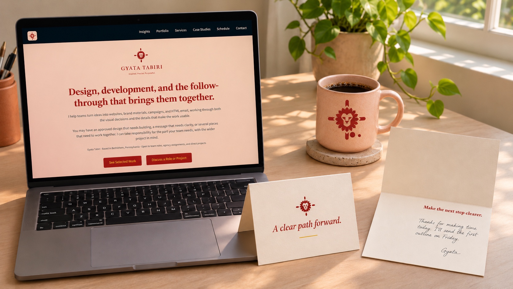
After the meeting
“A clear path forward.” on the cover. “Make the next step clearer.” inside.
Leave room for a handwritten thank-you and one specific action. The mug uses the Bloodwood mark on Peach Linen ceramic. Check the printed mark on the curved surface before ordering a batch.
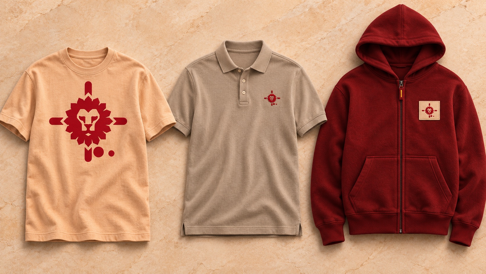
Everyday clothing
A chest print, small embroidery, and a woven patch give the same mark three different treatments.
Let the tee carry the larger print. Use a smaller chest mark on the polo and a Peach Linen patch on the hoodie to keep the Bloodwood mark legible against the fleece.
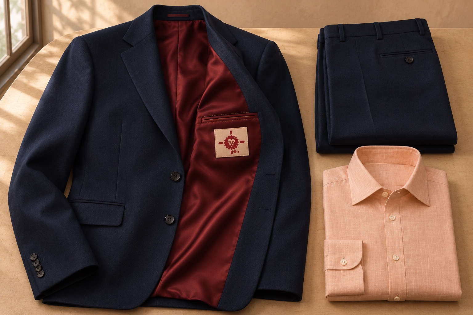
Tailoring
The woven label sits below the inside pocket, beside a few Golden Saffron stitches.
Keep the jacket and trousers coordinated in Midnight Indigo. Let the Peach Linen shirt and Bloodwood lining reveal the palette at different moments.
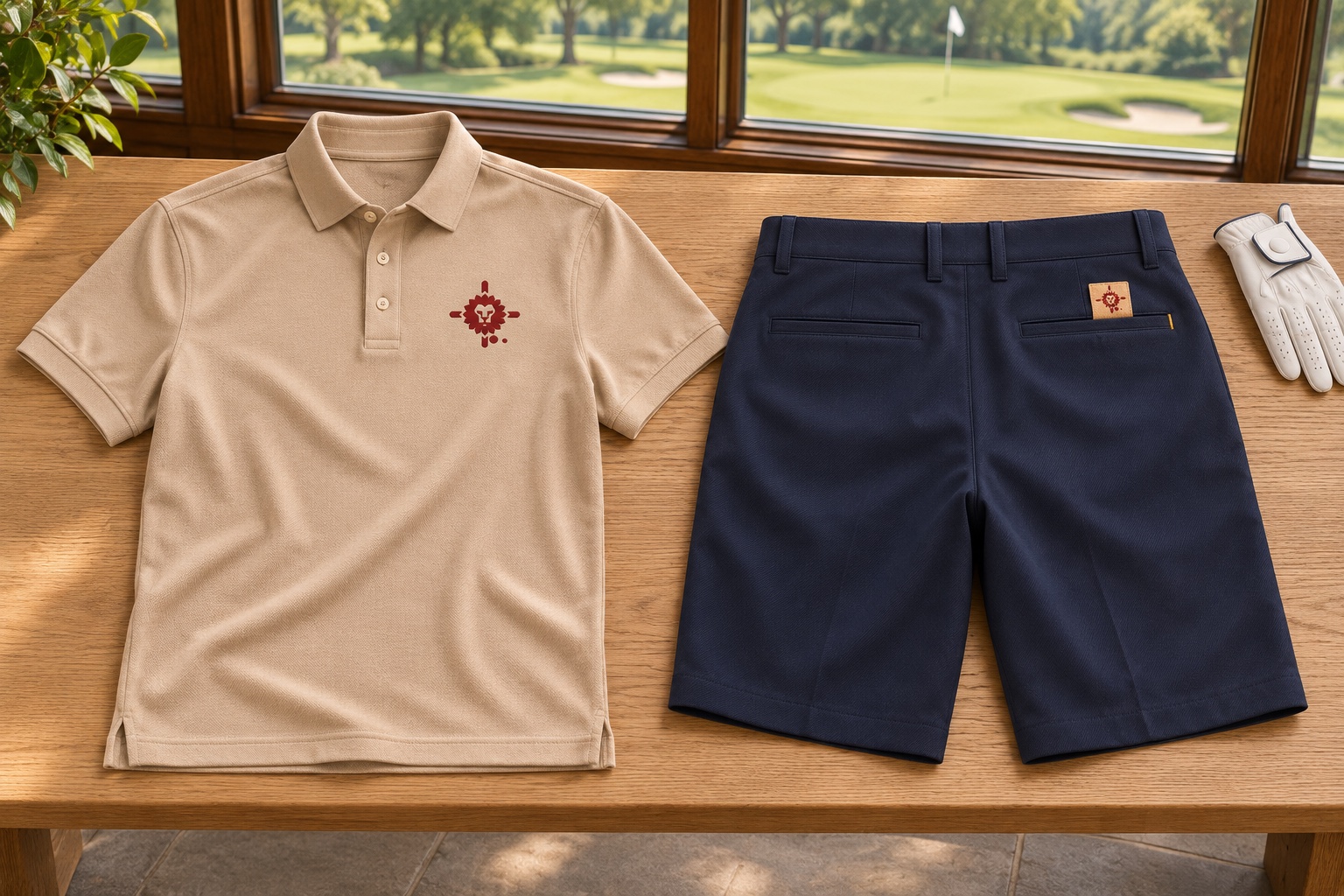
On the course
The polo carries the chest mark. The shorts carry a discreet tab at the rear pocket.
Check a woven sample at actual size. If the lion’s face or either circle closes up, increase the tab size until both read clearly.
On the road
The Escalade and XTS share a palette and a focal point. The panel shapes follow each vehicle’s body.
Position the mark where the complete silhouette can be seen. An installer should lay out the original artwork on measured panels and check the placement against handles, seams, and wheel arches.
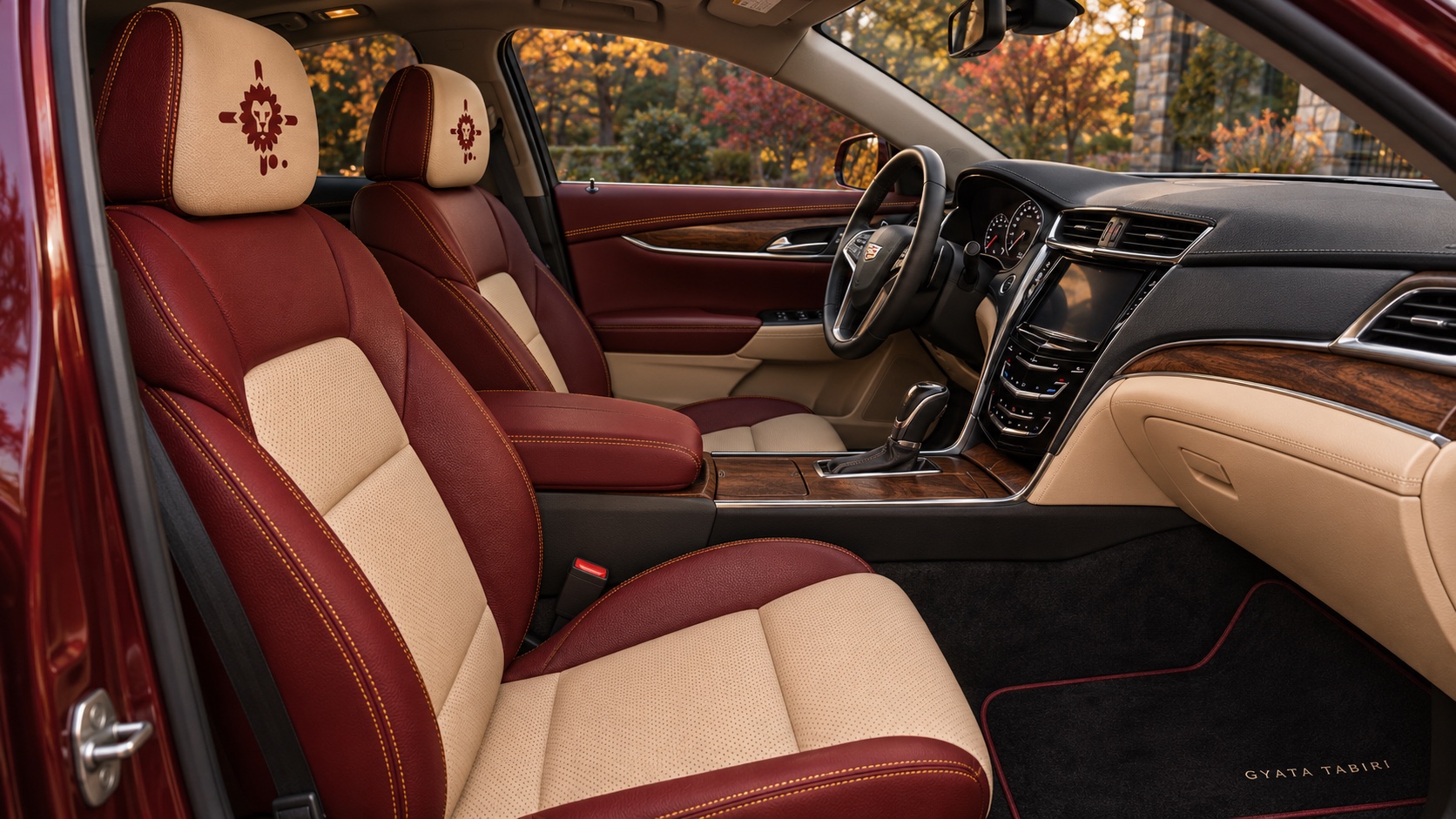
Inside the XTS
Perforated Peach Linen seat inserts, warm wood, and Golden Saffron stitching echo the exterior.
Keep the embroidered marks on the headrests and use the stitching to trace existing upholstery seams. Match materials against physical swatches in daylight.
05.03 / Production files and sign-off
Production files and sign-off
Planned. Record source artwork, stock or material, output requirements, proof, and approval.
06.01 / Decision records, changes, and exceptions
Decision records, changes, and exceptions
Planned. Document how to test a decision, record an exception, and update a shared pattern. The slider focus treatment is a candidate for the first worked example.
Use this as a working reference.
Choose a reading pattern first, then review the type, spacing, buttons, and component states together. Use the recipes with the shared fonts and stylesheet, and check the result at both wide and narrow widths.